View Poll Results: Which One Should it Be?

Voters
8. You may not vote on this poll
  • #1

    0 0%
  • #2

    6 75.00%
  • #3

    2 25.00%
Page 2 of 4 FirstFirst 1234 LastLast
Results 11 to 20 of 36

Thread: Help Wanted!!!

  1. #11
    Join Date
    Feb 2012
    Location
    Kingston, ON
    Posts
    356

    Default

    Sorry don't know how to do the double quote thing..
    I was going to do the retro thing but figured to up date it a bit.... like the less is more theory

  2. #12
    Join Date
    Aug 2010
    Location
    Oyama, B C , Canada
    Posts
    650

    Default

    Font is too large -regardless of stripe or no stripe.Don't rush --take your time and look around . Lots of great ideas out there!

  3. #13
    Join Date
    Mar 2010
    Location
    Arkansas
    Posts
    1,033

    Default

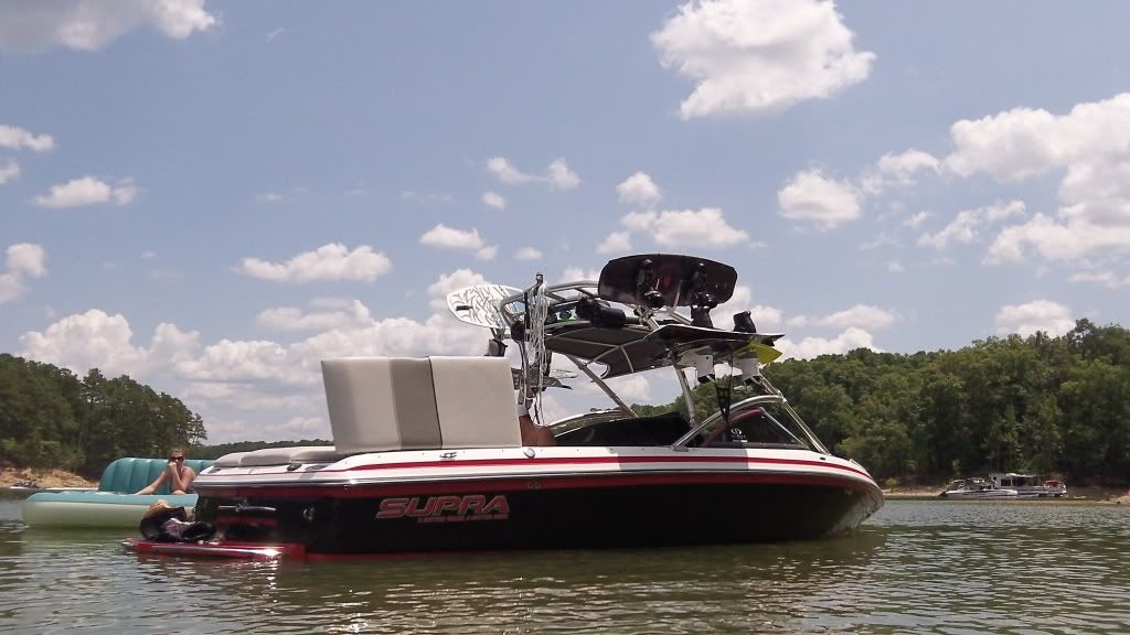
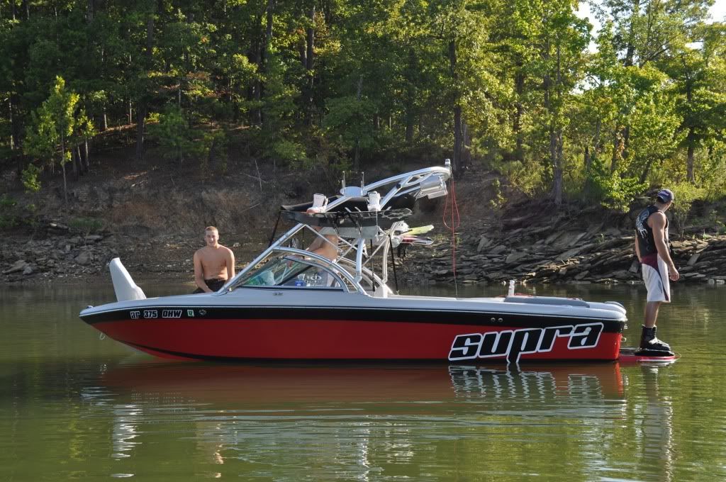
    Obviously, I like the plain side with just something at the back. I incorporated the supra logo into mine.

    What about the old school wave at the back?

    I will try to find some of the "ideas" they sent me when I was looking at doing mine. In the mean time, here is mine and a what a buddy did ...


    Last edited by KG's Supra24; 04-26-2012 at 01:09 PM.
    2006 Supra 24SSV

  4. #14
    Join Date
    Sep 2008
    Location
    Parkersburg, WV
    Posts
    1,940

    Default

    A few years ago when I was going through all of this I played with several colors. . . .

    This was my first choice . .


    And this was what we ended up with . . .


    Attached Images Attached Images
    Last edited by csuggs; 04-26-2012 at 03:18 PM.
    Clint
    Wake the World - West Virginia
    www.waketheworldwv.com

  5. #15
    Join Date
    Sep 2008
    Location
    Parkersburg, WV
    Posts
    1,940

    Default

    Here's another idea I was toying with

    Clint
    Wake the World - West Virginia
    www.waketheworldwv.com

  6. #16
    Join Date
    Sep 2008
    Location
    Parkersburg, WV
    Posts
    1,940

    Default

    Maybe I should get my wave back on. I have an " original" style wave in gray, that was supposed to match my gray water-line tape. We put the gray wave on, then the tape, but the two grays were not the same. So I ended up taking the wave off. I still have two. It was going to look like the pic in #14.
    Clint
    Wake the World - West Virginia
    www.waketheworldwv.com

  7. #17
    Join Date
    Mar 2010
    Location
    Windsor, Ontario
    Posts
    1,129

    Default

    Quote Originally Posted by haugy View Post
    Well you know I'm going old fashioned. I'm going to redo the stripe and the wave on my boat, but in charcoal gray and silver.

    I prefer the clean look. So if anything, I say less is more. Let the boat stand out, not the decal.
    250% I agree.

    Quote Originally Posted by ngavdba View Post
    You know what I've noticed. Everyone seems to think that losing the wave from the Supra corporate logo is/was the worst thing in the world a few months back. I know, I was one of them.
    Heck, I thought changing the original font is/ was the stupidest thing ever. I mean how many Supra fonts do I see while surfing on here? Three, four, maybe five different styles? How many fonts does Mastercraft have? Nautique? Ford? (btw, one simple oval design since 1912)
    People complained that brand loyalty is something the wave brought and now also gone the instant recognition of the product with it. Yet, 5 out of 5 enthusiasts on here restore a boat to near perfect condition and fail to put the one thing back one that gives it its true identity, the wave logo. The wave even up till the late 90's or early 2000's was a stylish icon on the side of the boat.
    I just don't get it I guess. I know I'm a Supra dinosaur. I had mine taken off, boat wetsanded and immediately without even a hint of doubt, had new vinyl back on. I never ever questioned it.
    I would rather put the wave and stripe back on in fluorescent orange or lime green before ever ditching it completely to "update" the look.

    I guess what I'm ranting about is so many of you got upset at the wave disappearing from the top of a website page, but nobody says anything when every day stripes and waves are removed with the good intentions of gelcoat restoration and then gone forever because buying a Supra decal is so much easier to put on than adding the wave back on. I mean if your boat is so "old and dated" with the wave, why care if Corporate feels the same?

    If your brand loyalty lies with all the different Supra fonts, then don't bitch at the wave icon leaving. If your brand loyalty is identified with the wave icon, then be loyal and show some Supra pride by putting it back on your freshly polished gelcoat. I really don't care either way. Seen it all on here and wish I hadn't!

    My opinion.
    With a boat with so much history why change the look so much. By trying to make it look newer than it is, it actually takes away its nostalgic beauty. Then again beauty is in the eye of the beholder ....
    Here is the best example of my vision; Transfer the white background to red and the stripe the same colour as the grey banding.
    Attached Images Attached Images

    2003 Supra Launch " Gravity Games Edition"
    Dodge ram CTD tow vehicles....

  8. #18
    Join Date
    Feb 2012
    Location
    Kingston, ON
    Posts
    356

    Default

    Anybody know what the original Font was for supra like you see on the 10 ann. edition. Not just on the side but the sunsport by the windshield?
    So confusing to decided what to do... you don't want to fork out $ for something and then say " I wish I had done..."
    The top bar looks grey but it's actually a cream color.

    decisions, decisions.

  9. #19
    Join Date
    Sep 2008
    Location
    Parkersburg, WV
    Posts
    1,940

    Default

    Quote Originally Posted by wiatowski View Post
    Anybody know what the original Font was for supra like you see on the 10 ann. edition. Not just on the side but the sunsport by the windshield?
    So confusing to decided what to do... you don't want to fork out $ for something and then say " I wish I had done..."
    The top bar looks grey but it's actually a cream color.

    decisions, decisions.
    We tried to find te "Sunsport Skier" decals and I truly believe there are none to be had. Also we tried to duplicate it with no success. It doesn't seem to be a font we could find.
    Clint
    Wake the World - West Virginia
    www.waketheworldwv.com

  10. #20
    Join Date
    Feb 2012
    Location
    Kingston, ON
    Posts
    356

    Default

    Seems to be the problem.... I emailed supra to see if they could point me in the right direction for a font... haven't heard back. Will have to try to get something close that I can give my letter girl.

    I liked the comment about finding something I'm happy with, but appreciate all the input and suggestions, so keep them coming.

Posting Permissions

  • You may not post new threads
  • You may not post replies
  • You may not post attachments
  • You may not edit your posts
  •